Running a successful community drive is about more than just goodwill; it's about smart logistics and effective planning. By leveraging data, you can move from instinct-based decisions to insight-driven strategies. Let's explore four powerful features in Community Care that help you do just that.
1. The Heatmap: Visualize Your Community's Hotspots
The heatmap feature provides a powerful, at-a-glance visualization of your operational density. Instead of just seeing individual pins, you can instantly identify areas with a high concentration of activity.
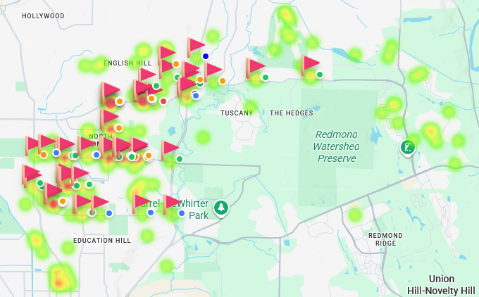
Insight in Action: In the image above, a troop is comparing the locations of their holiday Tree-cycling pickups (the heatmap) with where they've placed promotional Lawn Signs (the individual pins). They can immediately see that while their sign placements are widespread, the actual service requests are clustered in specific neighborhoods. This data is invaluable for planning next year's marketing efforts, allowing them to focus their resources on the most responsive areas.
2. The "Battlefield View": Your Live Dashboard
For an administrator, having real-time data is crucial. The dashboard provides a "Battlefield View"—a live, operational summary of your entire event as it unfolds.
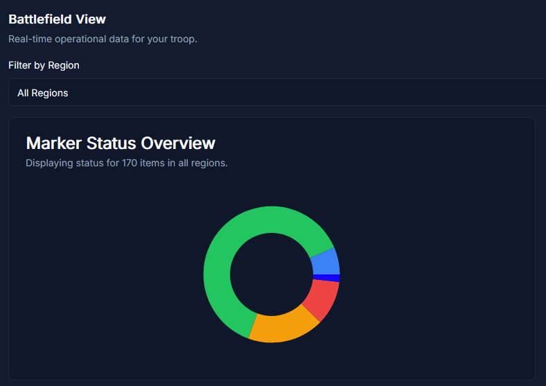
This panel gives you instant answers to critical questions:
- How many items have we collected so far?
- What is the breakdown of items by status (e.g., 'To Collect' vs. 'Collected')?
- How is our progress tracking against our fundraising goal?
- Who are our most active volunteers?
This eliminates the need for constant check-in calls and texts, allowing you to manage by exception and direct your attention where it's needed most.
3. The Route Planner: Optimize Your Logistics
Turning data into action is what makes it powerful. The Route Planner uses the location data from your markers to calculate the most efficient collection path for your volunteers, saving time, fuel, and frustration.
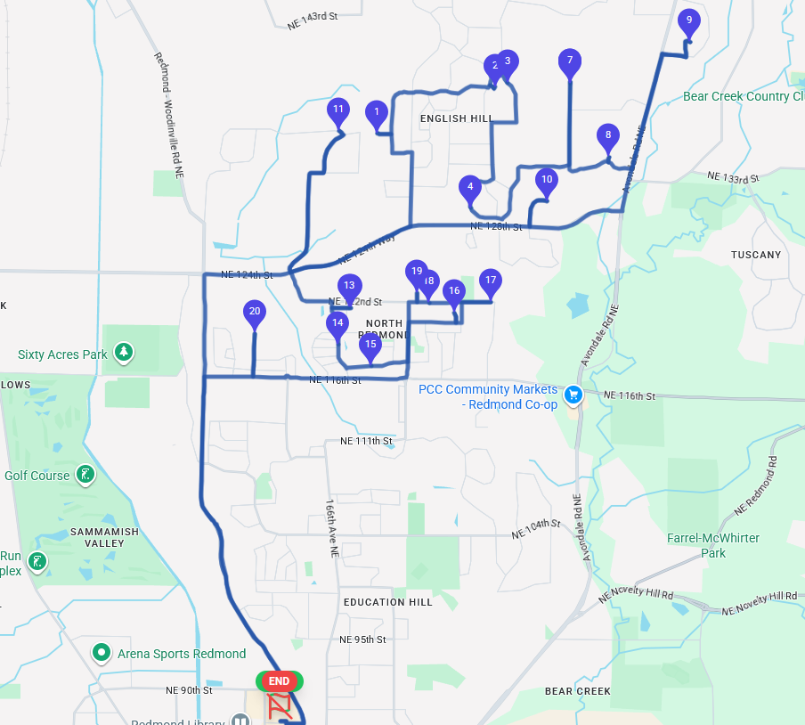
Insight in Action: Instead of guessing the best way to visit 20 pickup locations, a volunteer can simply enter their start and end points and let the algorithm do the work. This data-driven approach ensures that volunteer time is respected and used effectively, which is key to volunteer retention.
4. Regions & Markers: The Building Blocks of Your Plan
Data visualization starts with well-structured data. The core of Community Care is the ability to translate your operational plan into digital, map-based objects.
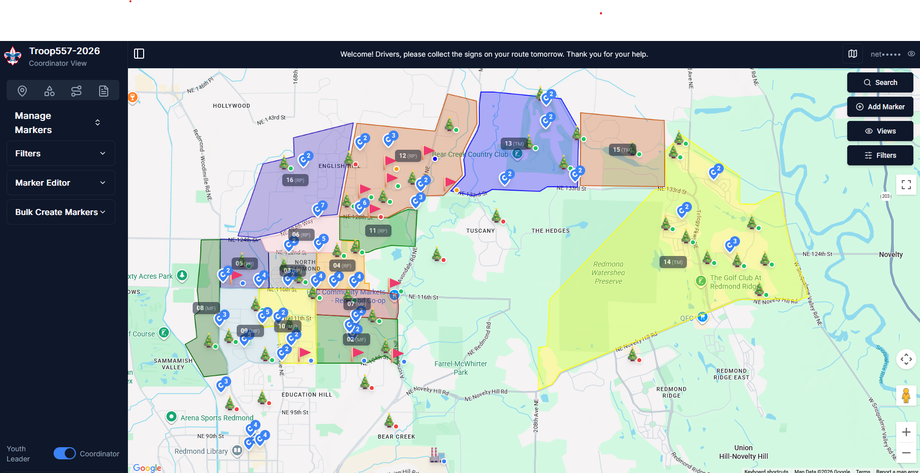
- Regions: Draw custom polygonal zones on the map to define territories, assign teams, and balance workloads. Each region acts as a container for markers and personnel.
- Markers: Each pickup, delivery, or task is a marker on the map. With custom types, statuses, and the ability to track financial amounts, these markers provide the granular data needed for all your reports and dashboards.
By organizing your event with this level of detail from the start, you unlock the ability to gain powerful insights, run more efficient events, and better showcase your troop's incredible impact on the community.